

A Football crest isn’t just a logo. It’s an entire identity. They tell a story about where a club comes from, what it stands for, and who it represents.
Barnsley’s badge has evolved several times across its long history, but every version has carried the same heartbeat: a proud industrial town and a football club shaped by its people.
Below is a brief look at how the crest has changed through the years, and what the modern badge says about Barnsley today.
Barnsley’s earliest crests were based directly on the Barnsley Town coat of arms. These designs were traditional, heraldic, and formal – the kind of crests you’d expect to see on civic buildings rather than football shirts.
They reflected the club’s deep connection to the town itself, long before branding or marketing entered the sport.
As football modernised, so did Barnsley’s crest. The club experimented with simpler iconography-based designs, often featuring the town’s symbols but in a more streamlined form. These iterations also included the classic initialism that many clubs donned in the 70s.
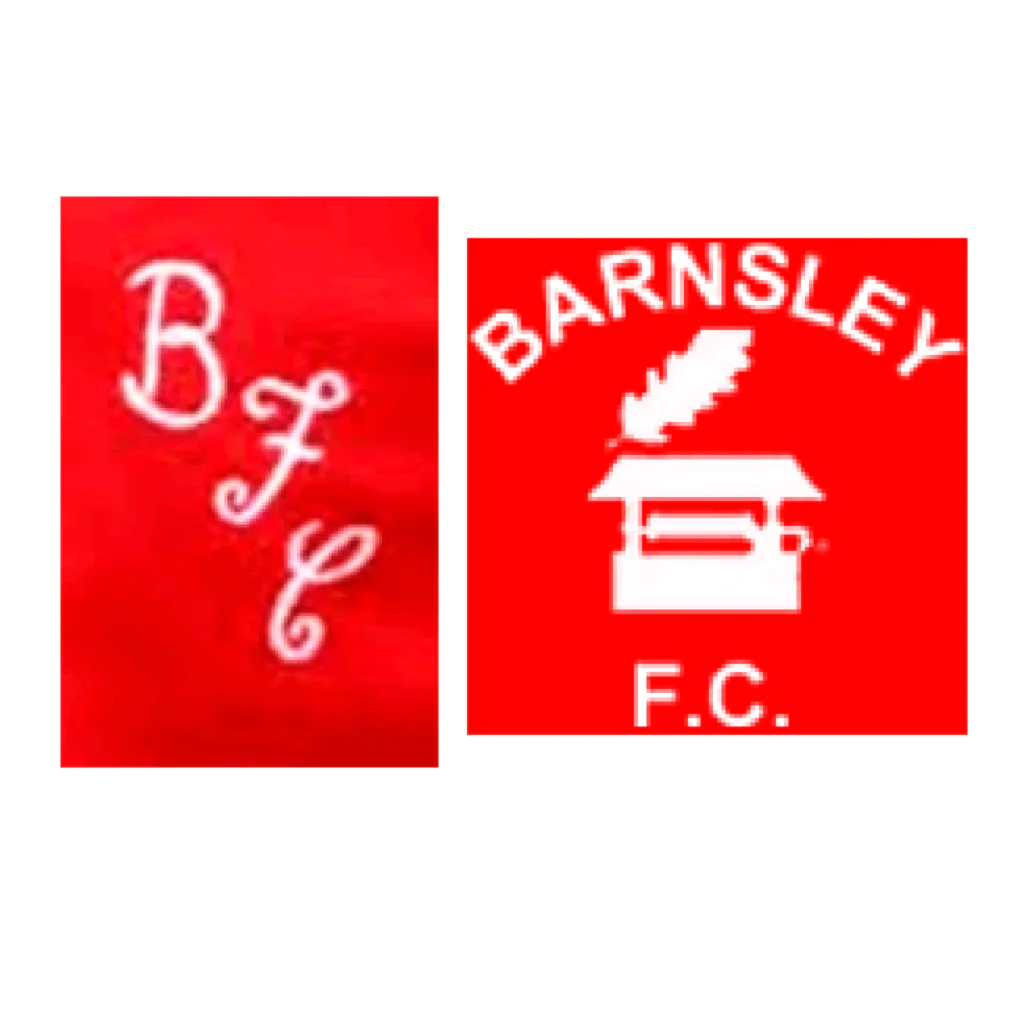
These versions were less ornate and more practical for kits, programmes, and merchandise.
They weren’t flashy, but they were unmistakably Barnsley.
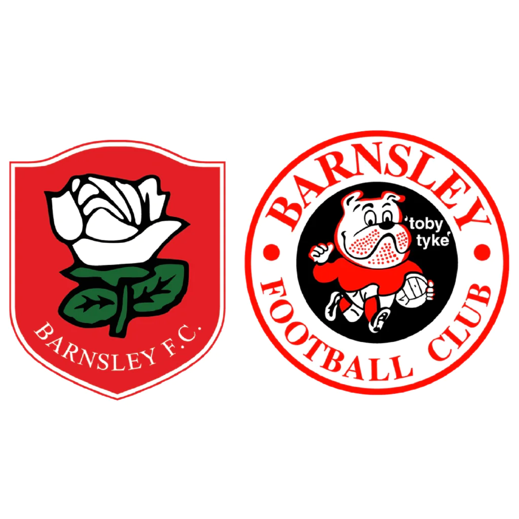
By the late 20th century, Barnsley leaned heavily into its industrial heritage.
Crests from this era often highlighted the town’s mining and glassmaking roots, reflecting the pride of a working‑class community during a period of huge social and economic change.
This era set the tone for what would become the club’s most recognisable badge – The Toby Tyke.
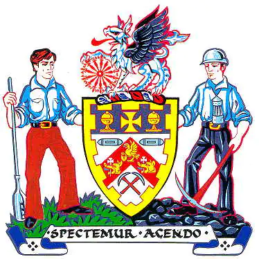
The current Barnsley badge is the most iconic and enduring version – a crest that blends tradition, symbolism, and identity into one design.
Every element means something, and together they tell the story of the club and the town it represents.
The two figures are the heart of the crest.
Together, they symbolise the people who built Barnsley, both the town and the club.
The central shield contains symbols from the town’s coat of arms, tying the club directly to Barnsley’s civic identity. It’s a reminder that the club isn’t separate from the town; it’s part of its fabric.
The modern crest features a griffin, taken from the Barnsley coat of arms and historically associated with the Wentworth family, one of the region’s most influential landowning dynasties.
The griffin symbolises:
Its presence on the badge connects the club to the town’s deeper historical roots and the families who shaped its early identity.
Latin for “Let us be judged by our actions.” The motto captures the club’s ethos better than any marketing slogan ever could.
Barnsley’s crest works because it isn’t trying to be modern for the sake of it. It’s rooted in history, built on symbolism, and instantly recognisable.
It tells the story of a club shaped by its people, and a town that never forgets where it came from.